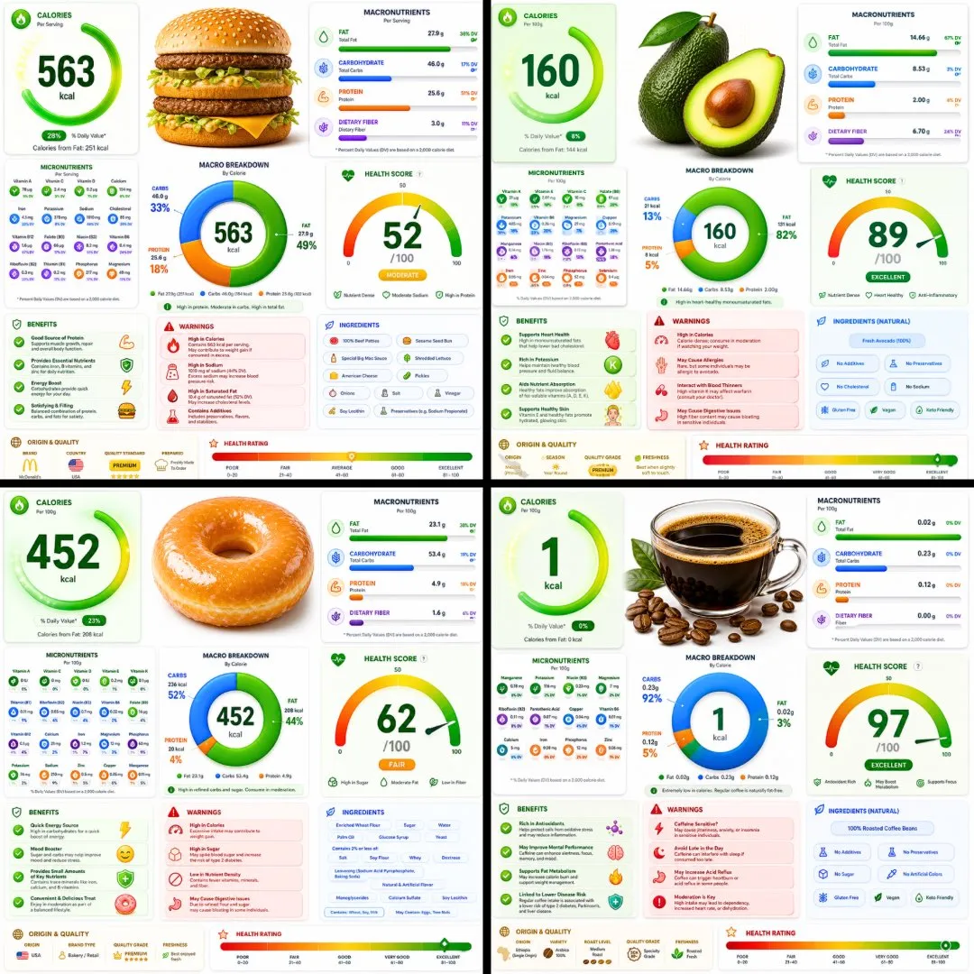
A vibrant ultra-modern nutrition infographic poster featuring a hyper-realistic 3D food render, colorful glassmorphism health panels, macro charts, nutrient dashboards, and premium wellness app aesthetics. The final image feels like a luxury health tracking interface transformed into a print-quality editorial poster.
Original Prompt
A ultra-detailed nutrition facts infographic poster of [FOOD], designed in a modern premium health app UI style. Bright white background with vibrant colored glassmorphism cards — electric green, coral red, vivid blue, and golden amber section panels with soft rounded corners and subtle drop shadows. The [FOOD] is shown as a large hyper-realistic 3D render at the top center. Below it: a bold circular donut macro chart (carbs/protein/fat) with bright gradient fills. Sections laid out in a clean asymmetric grid: Calories displayed as a giant bold number with a glowing ring indicator, Macronutrients with smooth gradient progress bars in bright colors, Micronutrients in a compact icon-grid layout with colored badge indicators, Health Score as a large arc gauge meter with a bold number, Benefits panel with bright green animated checkmark cards, Warnings panel in coral red alert cards, Ingredients list in a clean pill-tag style, Origin & Quality badges, and a Health Rating gradient bar at the bottom from red through amber to bright green. Typography is sharp, modern, ultra-clean — large bold headers, thin data text, tight tracking. Small nutrition icons next to every data point. Subtle grain texture overlay. No title bar, no tagline. Aspect ratio 1:1. Premium health app aesthetic, print-quality, ultra-detailed, bright and vibrant
Model
GPT Image 2
Output
image
aspect ratio
1:1
quality
high
How to Customize This Prompt
Keep the composition and change the subject. Or keep the subject and try a new camera movement. Small changes make results easier to compare.
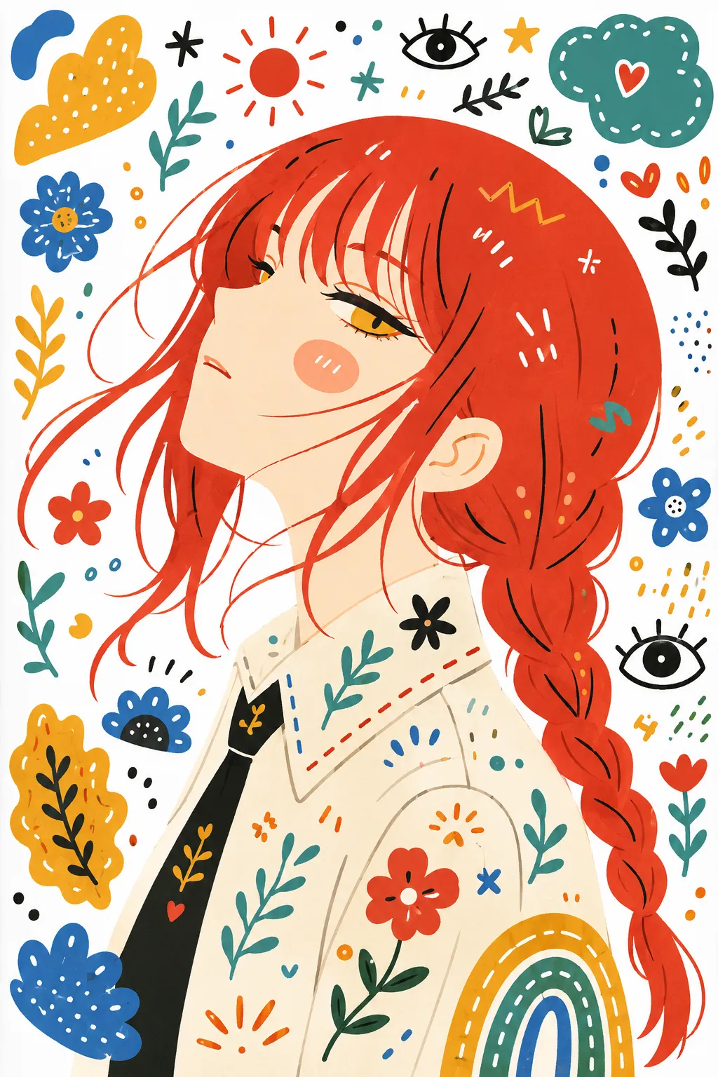
Playful transformation turning any image into a single decorative folk flat illustration with doodle elements, bold playful colors, simplified clean shapes, and a cute childlike whimsical handmade feel on white paper.
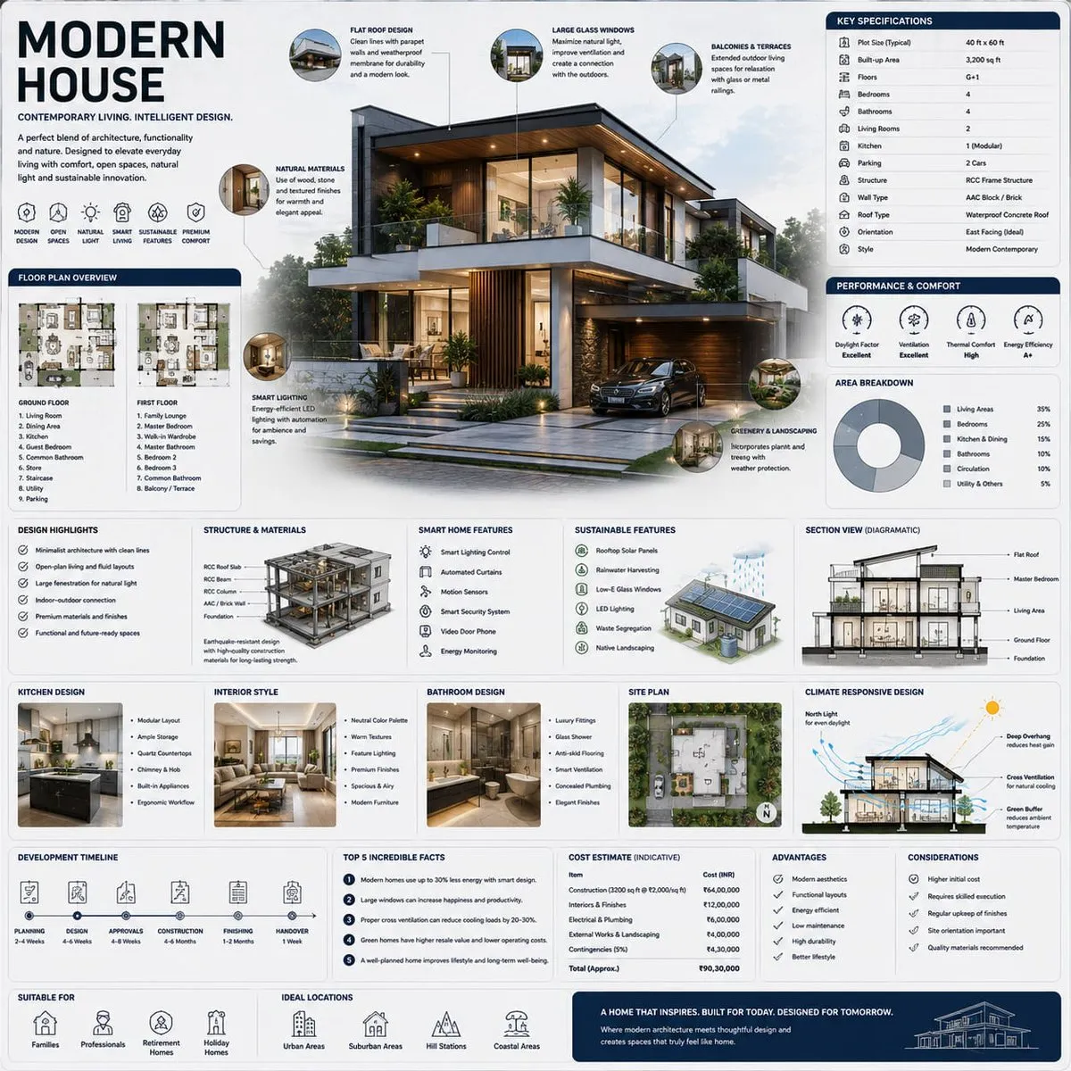
A museum-quality square architectural infographic showcasing a luxurious modern house as the centerpiece of a premium editorial handbook page. The design combines ultra-detailed residential visualization, blueprint-inspired schematics, and modular architectural knowledge systems in a refined, high-information-density layout.
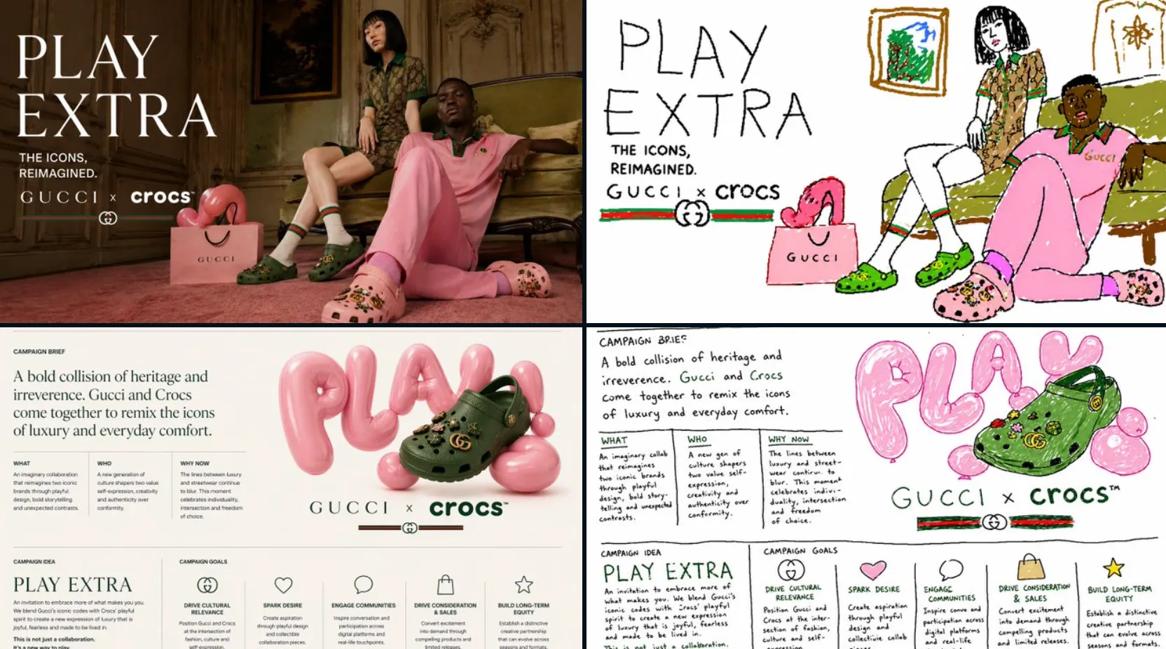
Redraws any attached image into the most clumsy, scribbly, and utterly pathetic MS Paint-style drawing on a white background. The result is vaguely similar yet awkwardly off, with confusing low-quality pixel-by-pixel details that emphasize how ridiculously bad it is.